# 20240222 Added for qmd to run
library(ggplot2)
theme_set(theme_classic())
data("mtcars") # load data

mtcars$CarBrand <- rownames(mtcars) # Create new column for car brands and names

mtcars$mpg_z_score <- round((mtcars$mpg - mean(mtcars$mpg))/sd(mtcars$mpg), digits=2)

mtcars$mpg_type <- ifelse(mtcars$mpg_z_score <= 0, "below", "above")

mtcars <- mtcars[order(mtcars$mpg_z_score), ] #Ascending sort on Z Score
mtcars$CarBrand <- factor(mtcars$CarBrand, levels = mtcars$CarBrand)Creating the Dot Plot Variance chart
The data preparation was used in the previous blog entitled: Diverging Bar Charts – Plotting Variance with ggplot2.
Refer to that if you need to know how to create the data prior to this tutorial.
Setting up the Dot Plot Variance chart
library(ggplot2)
ggplot(mtcars, aes(x=CarBrand, y=mpg_z_score, label=mpg_z_score)) +
  geom_point(stat='identity', aes(col=mpg_type), size=6) +
  scale_color_manual(name="Mileage (deviation)",
                     labels = c("Above Average", "Below Average"),
                     values = c("above"="#00ba38", "below"="#0b8fd3")) +
  geom_text(color="white", size=2) +
  labs(title="Diverging Dot Plot (ggplot2)",
       subtitle="Z score showing Normalised mileage", caption="Produced by Gary Hutson") +
  ylim(-2.5, 2.5) +
  coord_flip()
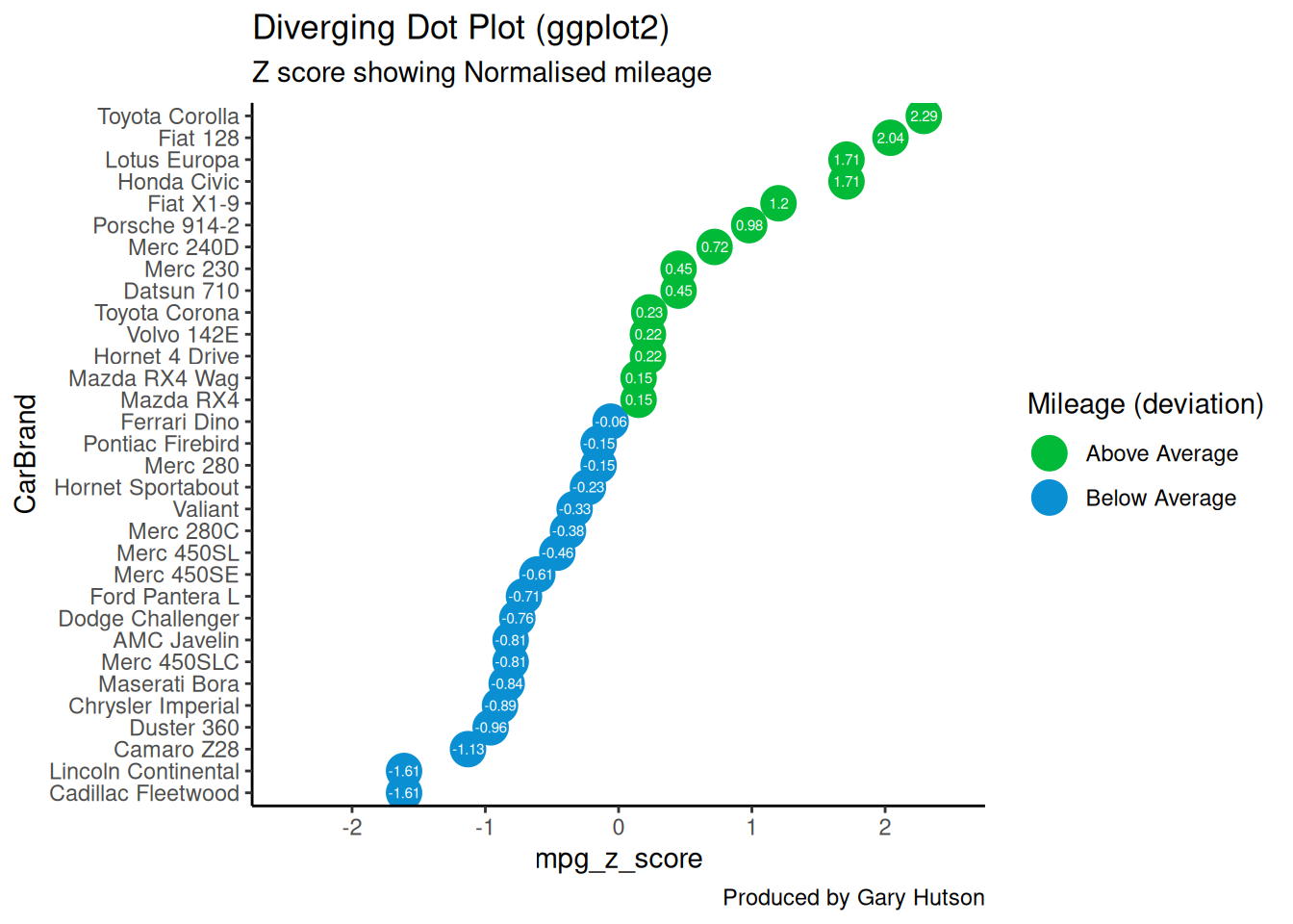
This is very similar to the previous plot we created in the previous post, however there are a few differences. The main difference is that we use a geom_point() geometry and set the colour of the points based on whether the said point deviates above and below the average. In addition, we use the geom_text() to set the colour of the text in the points to white and specify the size of the text. The final difference is that I have added a Y limit (ylim) range of -2.5 standard deviation to positive 2.5 standard deviations.
Running this block of code, along with the data preparation code, will give you a chart that looks as below:

Creating the Diverging Lollipop Chart
The code below shows how to build the diverging lollipop chart in R and ggplot2:
ggplot(mtcars, aes(x=CarBrand, y=mpg_z_score, label=mpg_z_score)) +
  geom_point(stat='identity', aes(col=mpg_type), size=6) +
  scale_color_manual(name="Mileage (deviation)",
                     labels = c("Above Average", "Below Average"),
                     values = c("above"="#00ba38", "below"="#0b8fd3")) +
  geom_segment(aes(y = 0,
                   x = CarBrand,
                   yend = mpg_z_score,
                   xend = CarBrand),
               color = "black") +
  geom_text(color="white", size=2) +
  labs(title="Diverging Lollipop Chart",
       subtitle="Z score for normalised mileage",
       caption="Produced by Gary Hutson") +
  ylim(-2.5, 2.5) + coord_flip() + theme(panel.grid.major = element_blank(), panel.grid.minor =
  element_blank())
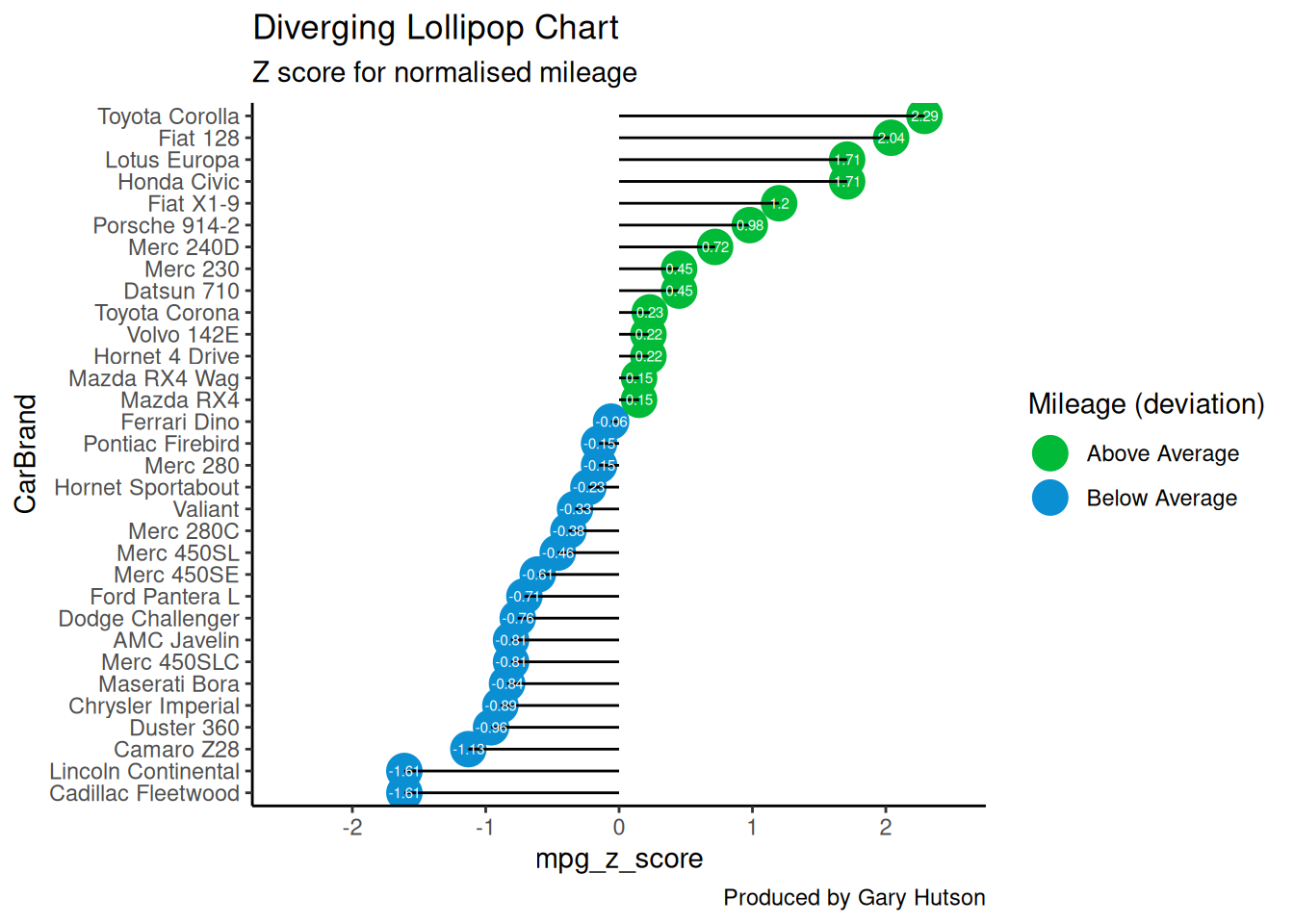
Similar geometries are used here. What has been added here is the geom_segment() this shows how the line segments need to be added. The starting y is equal to 0 on the Y scale and the starting x is the first car by the car brand. Similarly, the end of the x (xend) is also the CarBrand.
The only other difference is to add a theme constraint to the end of the code to turn off the major and minor grid lines, this is achieved by setting the panel.grid.major and panel.grid.minor equal to element_blank().
The completed graph and plot is shown below:

There – we now have some lovely looking charts that can be put into a report to report on variance between categorical variables.
This blog was written by Gary Hutson, Principal Analyst, Activity & Access Team, Information & Insight at Nottingham University Hospitals NHS Trust, and was originally posted at Hutsons-Hacks.